The Gamecube on a Small CRT
Recently I've been playing through The Legend of Zelda: Twilight Princess. I started this run using the Wii U and the HD remaster on a LCD and it just didn't feel authentic enough so I decided that instead I should connect the actual Gamecube to a small CRT TV I have and give that a try and, sure enough, that felt just right.
Now I'm not going to claim to know exactly why I think it looks good but it really does this game (and all games of the generation) a disservice when you just take the output signal, bilinear resample it up to HD (a blurry mess of an image), and then compare it to the HD remaster. To understand why these images looked good to us back when these consoles were new, I think it's important to look at how the image gets processed as it goes through the Gamecube's analog output and when it arrives on the screen.
Source Image
In order to get as clean a source image as possible I started with a screenshot of the Wii version of Twilight Princess running in Dolphin at 1080p. I don't have any Gamecube emulators set up myself so this was the best compromise I could come up with.
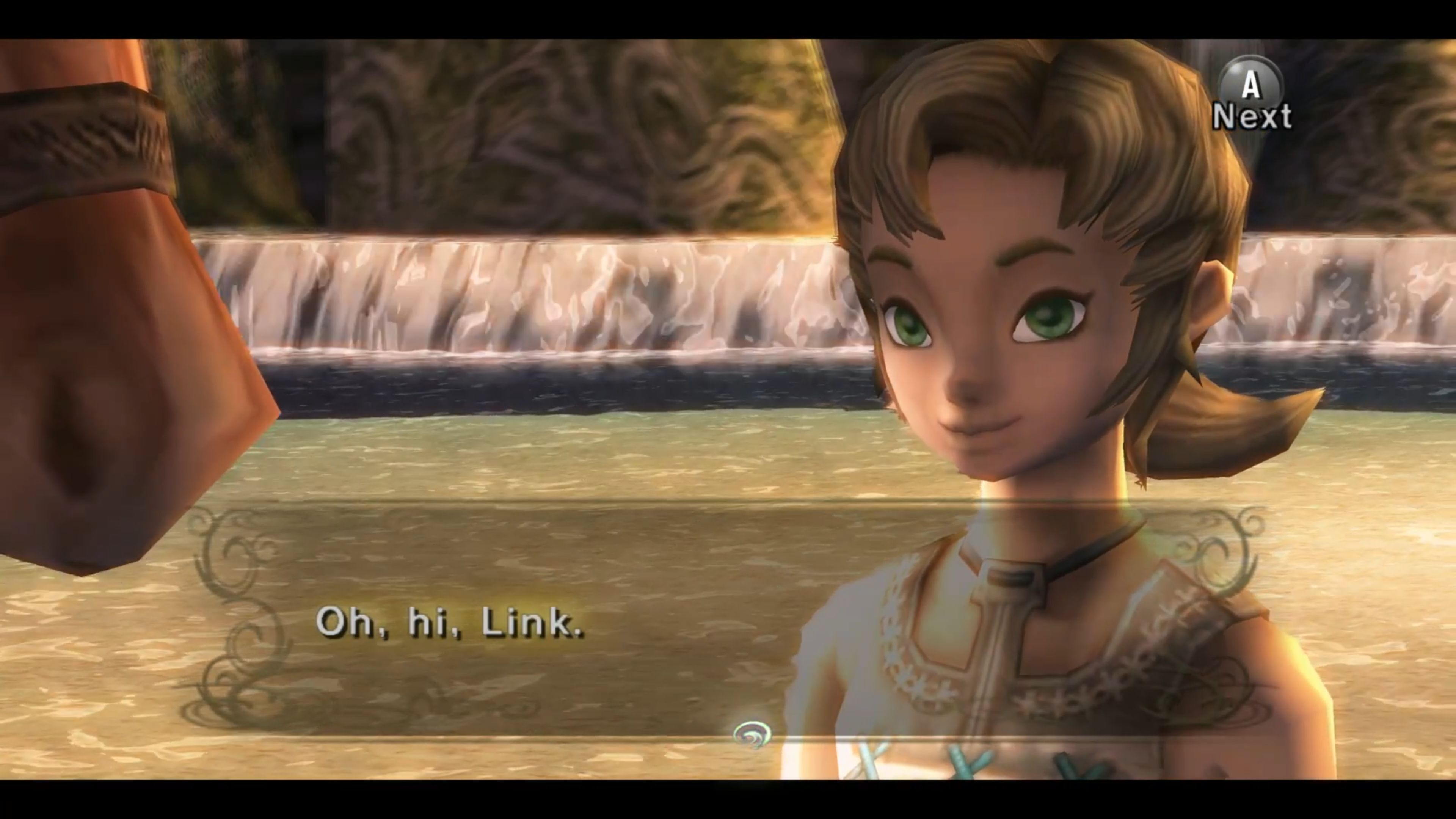
I then took that image and downsampled it to 480p using nearest neighbor sampling to minimize the effect of antialiasing. (I also picked this screenshot because, with the camera zoomed so far in, there wouldn't be any difference in mip map levels between an HD and SD screenshot - all textures are at their highest detail levels).

This gives us a very clean starting point.

Simulating Gamecube Output
This emulator screenshot is a smooth 24-bit color image, but most Gamecube games were rendered in 16-bit color with dithering (I think using the same 8-tap dither that the N64 used, going by the horizontal line artifacts that appear in a lot of Gamecube games).
Of course, if you're outputting to a consumer grade CRT in the year 2001 that means interlaced video. We don't actually have 480 lines of resolution to work with we have 240 - but the Gamecube and Wii both have a hardware flicker reduction feature. This blurs the image vertically so that even though you're getting your 480 lines in two 240p fields, each field contains visual information from all 480 lines.

In motion, the interlaced signal looks more like this:

Simulating the CRT
This is then all output as an analog signal - which introduces an interesting quirk. Since the image is built line-by-line, the signal itself is only analog as you scan horizontally along the line. The lines that comprise the image are discrete:

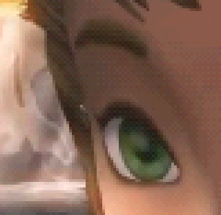
These horizontal lines of signal are then sent to the scanning electron beam, which fires electrons through a dot mask onto a grid of red, green and blue phosphors. This grid has some interesting properties. One is that it's usually not a square grid - most cheap TVs have this arrangement where each column of red, green and blue phosphors is staggered.
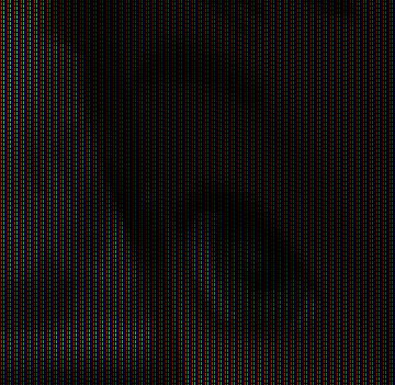
Another thing worth noting is that these are not "pixels." Each one of these red, green and blue phosphor elements is completely analog in its own right. The beam may light up any portion of the phosphor at any level. So, even though most small TVs will have fewer than 640 columns of phosphor elements, they're perfectly capable of displaying a 640 pixel wide image with clarity.
The picture tube itself is usually slightly frosted, and human beings don't have eyesight sharp enough to pick out every individual phosphor at distance, so this whole image is perceived as something somewhat softer. (And, of course, a heck of a lot brighter than the above simulation).
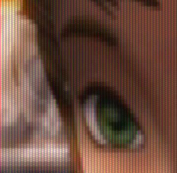
And through the magic of persistence of vision, our brains perceive both fields simultaneously:

All Together
While it's really impossible to truly simulate the effect of viewing a CRT in an image displayed on an LCD display, I think this little exercise demonstrates some of the effects and how they work to hide flaws from a low-resolution 480p image.
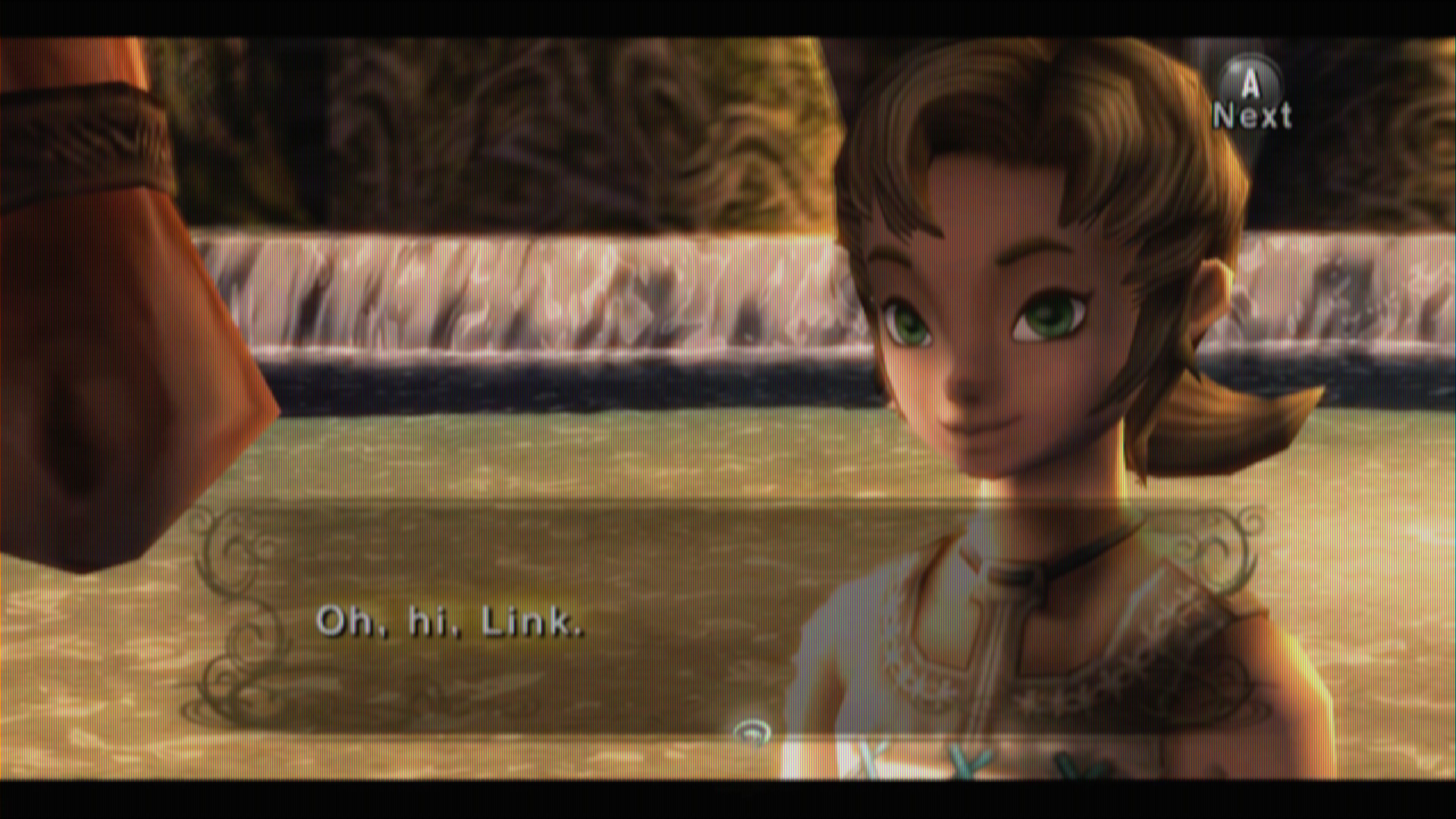
Polygon edges are significantly softer despite there being no intentional anti-aliasing, and some of the low resolution textures (the rocks in the background, the horse's bridle, Ilia's hair and the blue stithces on her shirt) are slightly improved. There's no additional detail, but the telltale bilinear grid is less visible.